Arco Interpharma - Modernizing logo for the next level
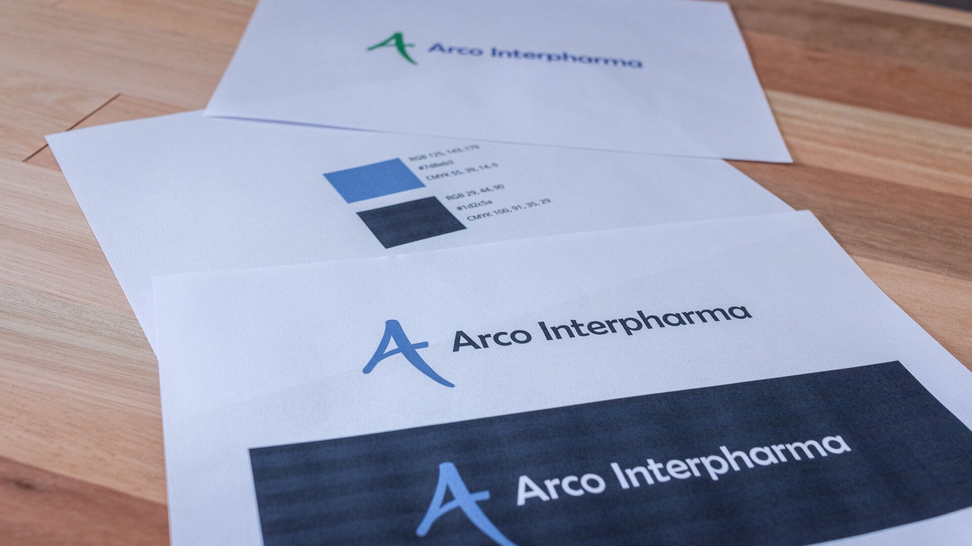
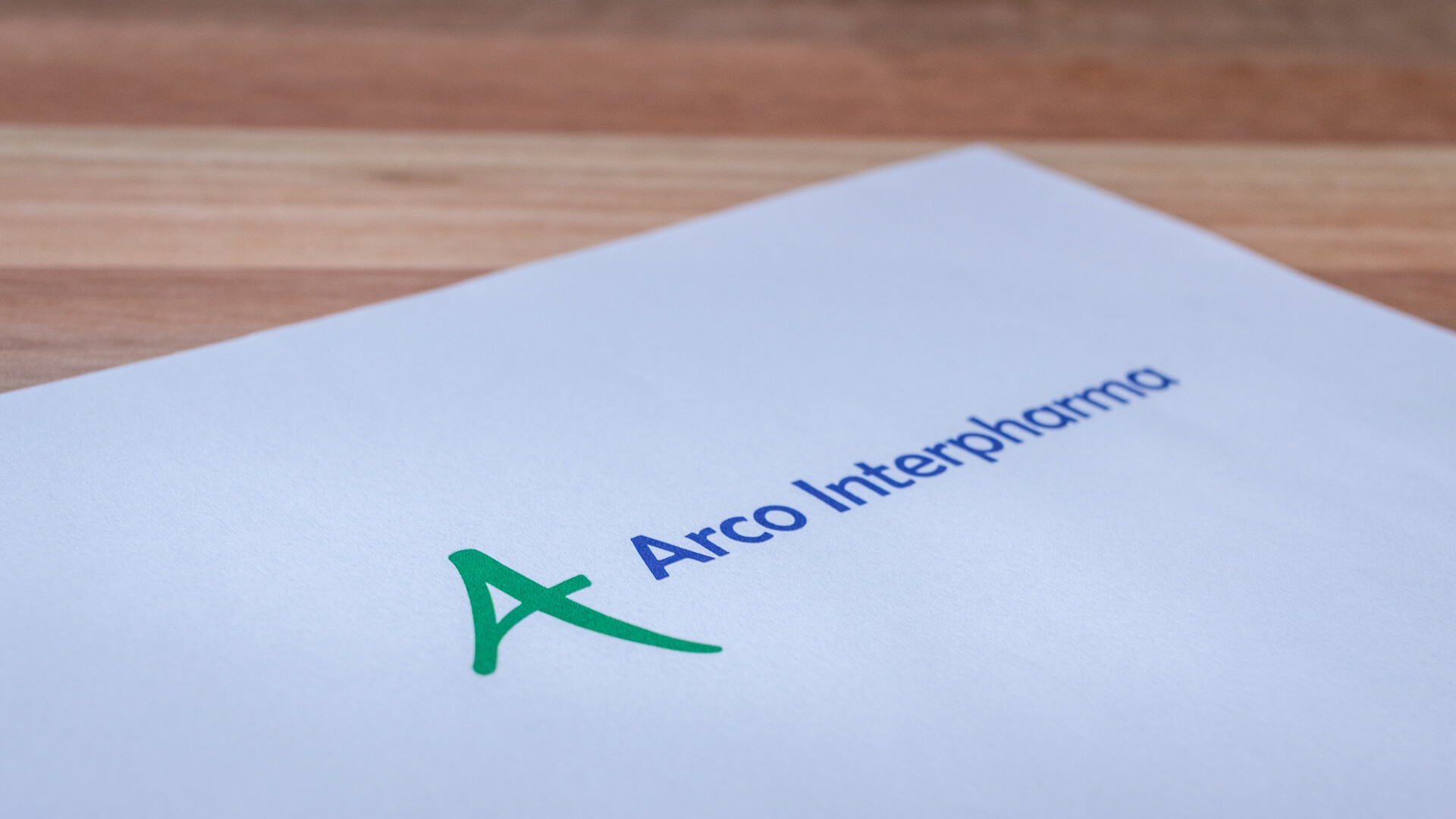
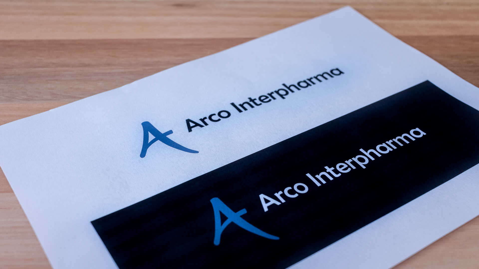
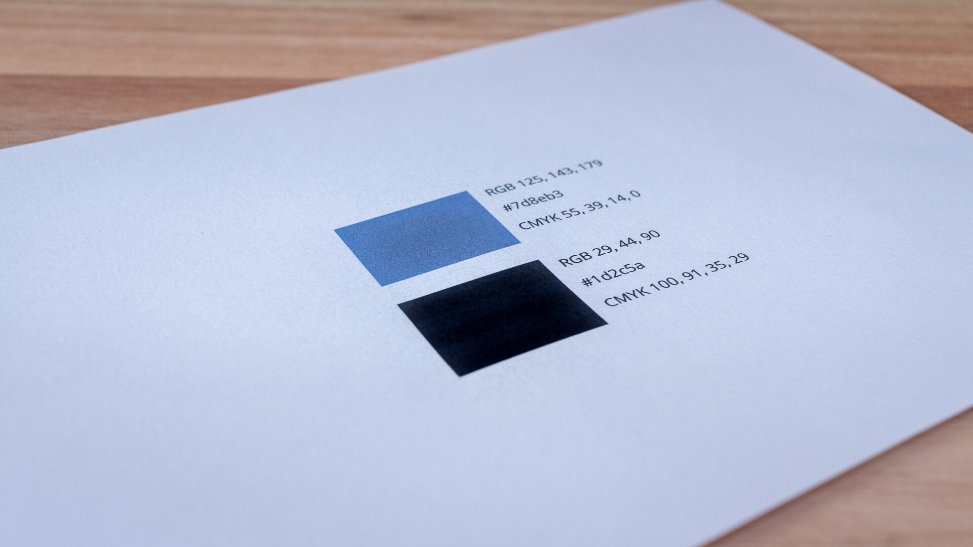
Modernising is an important part of keeping up with the rest of the world. So when Arco Interpharma got in touch and wanted to relaunch there product online we decided that it was time to also update the logo ever so slightly. The logo as a shape was still looking great, but for the logo to fit with the more sophisticated style choice that we wanted to go for on the website and in graphical material. So we color adjusted the logo.
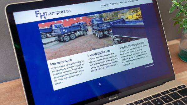
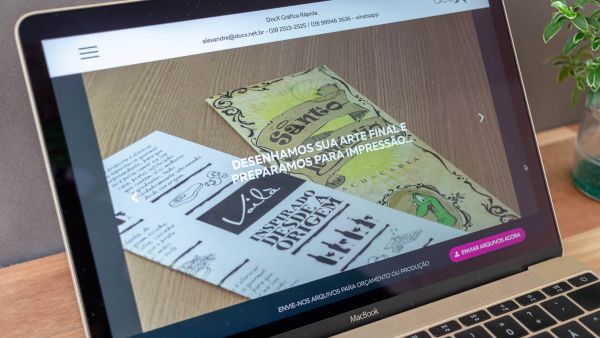
This logo adjustment was a part of a bigger project that involves product focused website, a detail focused product photoshoot and graphical designs services.
More work
