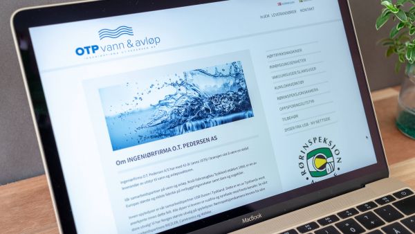
OTP logo design - Based upon norse mythology
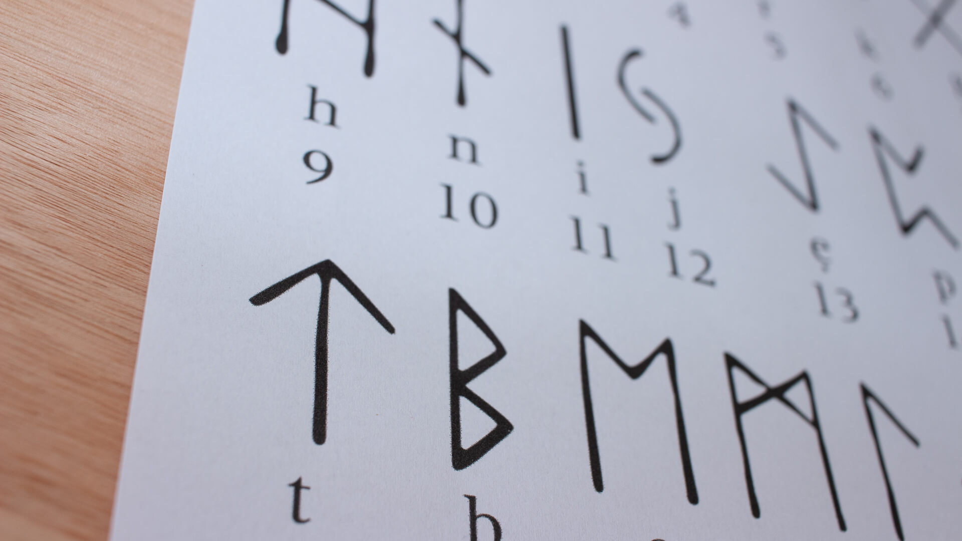
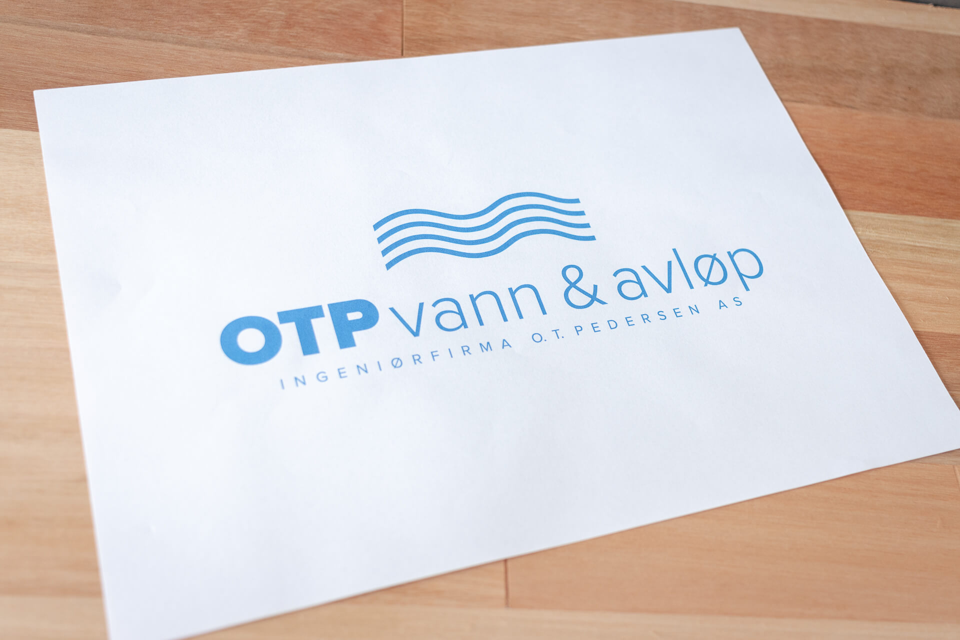
When it was time to expand the business segments OTP needed a logo to reflect there history and yet separate the two very different business segments from each other. To highlight the differences, but still show similarity. We made the logo symbols based on norse mythology since the company is rooted in the nordic countries. The norse mythology alphabet also called "runes" was created as early as year 100-200.
More work
